|
|
Post by Yangi on Sept 7, 2014 11:53:40 GMT -6
Voices of Ilya
The new Setup from my JROCK Adventures, however without WITCH and instead with a whole new set of characters, Locations, work of Magic and much much more!
There's not that much art to show yet but I hope that's going to Change over the next months.

To get you into the mood, here a little sneak Peak. I'm still working on getting a bit away from the whole WITCH style... it's harder than I thought. Anyways that's me drawing some Magic XD |
|
|
|
Post by Yangi on Sept 7, 2014 12:05:41 GMT -6
Old and new
I used the poses from the old JROCK Ultimate uniforms to check out how my new set for Voices of Ilya works out. The noses will be changed a bit (still look a lot like WITCH!) and Rhinoa's face Looks a lot like mine, how I was told so I'll Change that too.
Well but it was merely to see how the uniforms and signs worked, wording etc.

|
|
|
|
Post by Yangi on Sept 7, 2014 12:09:03 GMT -6
COLOR TEST
Since I changed a few things with the Colors and of cause a lot with the entire uniforms, I tested it on CC in this Voices of Ilya preview Picture.
Back then I still had no solution for the WITCH-nose issue... I'm working on that though. Or rather I already have a solution but still Need to test it out.

|
|
|
|
Post by Yangi on Sept 7, 2014 12:24:30 GMT -6
LOCATION SKETCHES
A sketch I made spontaniously. It's a new Location that will be implemented rather late in the books I'm afraid. A deserted place with a thriving City, containing a gigantic Labyrinth inside it's outer walls.
More info on the actual Location etc, will follow later on.

|
|
|
|
Post by Cole on Sept 7, 2014 12:28:04 GMT -6
This sounds very, very intriguing! I'm a bit disappointed that I'll have to wait quite a while before I can see what you do with this place.
|
|
|
|
Post by Yangi on Sept 7, 2014 12:51:30 GMT -6
Haha yeah but don't worry there is quite some Information I'll reveal before the books. Like who lives there and how they look and more sketches of the surroundings and so forth. At least that's planned so lot's to look Forward too  |
|
|
|
Post by Cole on Sept 7, 2014 13:08:33 GMT -6
That certainly is something to look forward to!
|
|
|
|
Post by Yangi on Oct 13, 2014 1:59:21 GMT -6
New art style test
This is only a test to get a new kind of drawing style for the Voices of Ilya project. It's how I used to draw a lot before getting into that whole WITCH drawing thing. For me it's still a bit... well I need to get used to it. But I guess it's kiind of nice. I'll do some more sketching and see how things work out.  
|
|
|
|
Post by Cole on Oct 13, 2014 2:43:04 GMT -6
It is nice, but it will take a little while to get used to it.
|
|
|
|
Post by Yangi on Oct 13, 2014 6:13:56 GMT -6
Thanks! And yes I know. Same here. It's a bit strange after all that Witch-drawing to finally get back to my original style  |
|
|
|
Post by Cole on Oct 13, 2014 10:29:52 GMT -6
I can still tell who each one is, its just odd having spent so much time seeing them a certain way and then suddenly they have a different style in their design.
|
|
|
|
Post by Yangi on Dec 16, 2014 7:48:38 GMT -6
Christmas GreetingsI just wanted to do something Christmasy for Voices of Ilya too so I repainted an old picture of Jess, hence the old Disney style. 
|
|
|
|
Post by Yangi on Jan 8, 2015 11:28:23 GMT -6
Jules & the GuardianJules, a newer character for Voices of Ilya. This picture will be part of a cover together with the Guardian and the evil that will play a bigger part in the possible RPG and the stories.  The Guardian from Voices of Ilya. Like Jules' picture this is part of a cover I'm working on. 
|
|
|
|
Post by Yangi on Jan 8, 2015 11:34:56 GMT -6
"Voices of Ilya" Cover SketchA sketch for a possible cover for "Voices of Ilya". So far I like it a lot, though I'll mostly have to work on Kia and I don't know yet about the background but I'll see to that later. 
|
|
|
|
Post by Cole on Jan 8, 2015 14:22:39 GMT -6
I like the cover sketch!
I've actually had this desire to see a group picture of the Guardians for the past few days. It was actually for my next gen that I had the thought, but the timing of everything makes this a pleasant surprise!
|
|
|
|
Post by Yangi on Jan 9, 2015 2:34:03 GMT -6
Thanks!
Yeah I just had to do something for Voices of Ilya. Haven't been doing anything for that in a while. So I sat down yesterday and made three concepts for different covers. Jules and the guardian(the two other picture I uploaded here) are part of one, then the Paragon Gang and then there's a third one which will be featuring the dark side. Not sure yet who and what exactly but I made a quick sketch for a nice cover concept. Have to think about what people will be shown next.
|
|
|
|
Post by Cole on Jan 9, 2015 5:30:07 GMT -6
I think the Paragons should be on the cover. At least on the first one. They are the main focus, so they should be on the first cover. The others though could be nice covers for different chapters.
|
|
|
|
Post by Yangi on Jan 9, 2015 5:50:09 GMT -6
Of cause they're on the first cover.
I meant, I made concepts for different covers. Not several concepts for ONE cover. So... it's more like, I made the sketch for the Voices of Ilya Cover and made some concepts and a bit of LineArt work for general artwork. Maybe the Jules, Guardian + unknown - artwork will later become the cover for book 2 but I really don't know yet. Sorry for the irritational phrasing. It's a bit better in the List I made in "Story and Character Discussion".
So, YES the paragons will be on the Cover for book 1 and/or comic etc.
Just finished the concept for "See them run", another artwork for book 2.
|
|
|
|
Post by Cole on Jan 9, 2015 6:25:42 GMT -6
Ah, I see. Thanks for clearing that up.
|
|
|
|
Post by Yangi on Jan 20, 2015 2:00:53 GMT -6
I present to you: Aiden & Enrie!!!
Here's a small comic about my newest two characters Aiden and Enrie.
I adore them both quite a deal and this is only the start of a series of comics and pictures about those two.
To clear things up a bit, Aiden (the blond one) is not really human. He's a Neyma which could be easiest refered to as some kind of a nature spirit. Neyma can only fall in love under very specific circumstances which means they basically have no clue whatsoever what love actually is or feels like.
Enrie is a Cheshi, which means she was born with magical talent. She has magnetic power and can attract and push away metal objects as well as human like bodies. The latter only works sometimes and can cause quite some trouble...
In this scene there's someone coming along talking about the heart on the shirt, that it doesn't suit him but Aiden misunderstands and argues with 'love' which irritates mostly Enrie who had no idea he felt that way about her...
Then it becomes clear, Aiden just talks nonsense so Enrie decides to quickly leave the scene before the stranger get's mad or the embarrisment of hers becomes clear.
I thought it looked funnier with just symbols instead of words.

|
|
|
|
Post by Cole on Jan 20, 2015 9:08:16 GMT -6
I love the last panel!
|
|
|
|
Post by Yangi on Jan 23, 2015 3:12:39 GMT -6
Haha yeah me too! I really like him in the second one but the last is the funniest  |
|
|
|
Post by Yangi on Jan 26, 2015 5:04:27 GMT -6
Fonts and Symbols
Since I haven't been able to decide on a fonts and symbols etc yet, and haven't shown much of those I decided to change that. For a reminder, these are the symbols of the Paragon:  This is the current symbol for the Council:  And now to the new stuff. I still need to set on the Colors and the font for the title if you know what I mean. Logos and stuff. So here are the three typo/fonts that I like the most with some effects (it's mostly about what font I will take!): 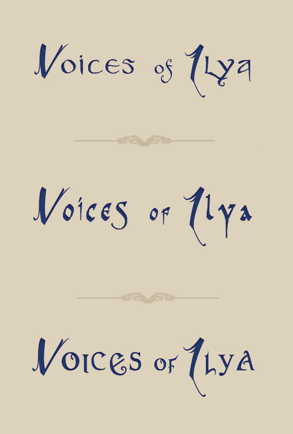 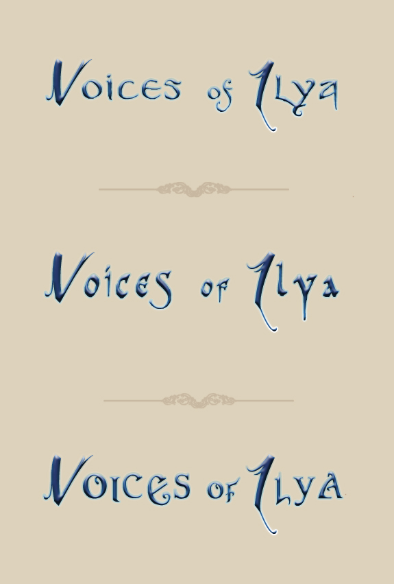 And I wanted to have a short version of the title sort of as a symbol for EVERYTHING that has to do with Voices of Ilya so these are the ideas:  Feel free to state your opinion. I will take a look at them myself. I think so far I like... Font 1 and 2 more than font 3 and the symbols... I think 1 and 2 (row 1) and 4(row 2, 1st symbol) for the short symbols... And the favorite symbols tested out for some forum functions: 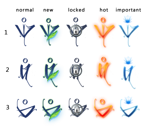
|
|
|
|
Post by Cole on Jan 26, 2015 14:58:49 GMT -6
When it comes to the logos I like the first one the best, but I think maybe you should consider mixing them up a bit. Like the first one is the best overall, but I like the way the C is done for the third one better then the other two. There are other little examples like that, but they are a little harder to decide between especially in comparison to the C.
The symbols are a little harder. The three you like best are the ones I think are the best as well, but mostly for me it comes down to 1 and 2. Its really 50/50 there. Sometimes I like 1 better, other times I prefer 2.
And just for the record with the Paragon symbols. I like the 3rd one the best and the 5th one the second best.
|
|
|
|
Post by Yangi on Feb 25, 2015 3:38:44 GMT -6
Voices of Ilya Logo - LineartSo I had some time left after work yesterday and decided to give my new logo for the project a try. It worked better than I had originally thought! Sure, it's not finished yet. I still have to determin the colors and do some editing on the title font (which will be put into the picture later, too) but considering that I've never really done anything fram-ish, interface-ish I think it went pretty well and only cost me 3 hours! (that's not much!) Oh and the symbol in the middle is the final design for a symbol to represent the whole project Voices of Ilya. In my previous post I presented some ideas and yesterday and I took my personal favorite and worked it out a bit more. I'll continue with the title next and then the colors whenever I have a few hours after work again. 
|
|
|
|
Post by Cole on Feb 25, 2015 14:16:58 GMT -6
I have to admit, that is far more then a logo then I expected to see.
My initial thought was that it just be a name and that'd be it. So imagine my pleasant surprise to see far greater detail in a nicely done logo.
|
|
|
|
Post by Yangi on Feb 26, 2015 3:47:31 GMT -6
tihi! I'm a perfectionist, I can't just have a "normal" Logo. Besides I wanted it to look nice... I took a lot of inspiration from different game logos and well... I wanted something special, something interesting and remarcable. Something that would make people curious of the things behind it like in my case the whole project Voices of Ilya. I'm happy you like it! I just hope I can get a nice version of the title itself done too. Might take longer than this whole thing did... Making text look nice is harder than I thought.
|
|
|
|
Post by Cole on Feb 26, 2015 10:32:02 GMT -6
What about those few options you had for text? Did none of them work for you?
|
|
|
|
Post by Yangi on Mar 3, 2015 4:44:01 GMT -6
I chose my favorite out of those choices but they are just... tests so to say, like a rough sketch and now I have to make the final version out of it. Like the symbol I chose for the project. I created it out of my personal favorite which is Number 2 if you look up at the different symbols. I altered and edited it a bit until I was satisfied. That's what I still have to do with the text. I will alter and change it around until I like it and it matches with the logo design.
|
|
|
|
Post by Yangi on Mar 13, 2015 6:13:42 GMT -6
Game Interface SketchesSome time ago I made a few sketches how the interface of a Voices of Ilya RPG game might look like. I just found them and thought I might share them. 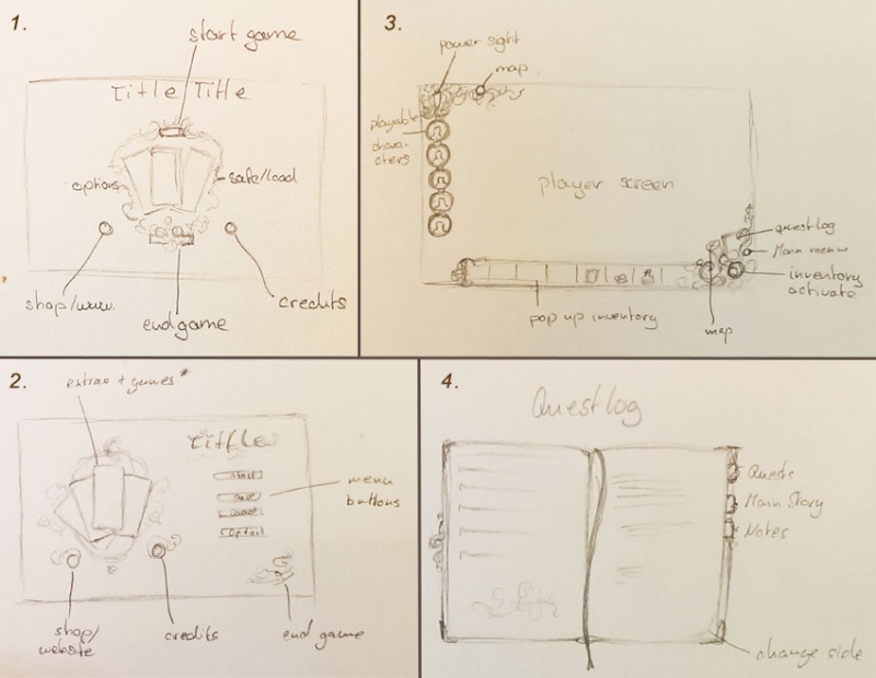 1. One idea how the main menu might look like or be structured 2. Second draft for the main menu 3. Game screen - aka the screen people would see while playing 4. Questlog or some other game related info like world and character info etc. Was quite interesting to think about, what kind of info and possibilities I wanted the player to have simply via interface of the game.
|
|