|
|
Comics
Jan 16, 2018 6:05:08 GMT -6
Post by Yangi on Jan 16, 2018 6:05:08 GMT -6
Okay I think I like these ones the best. What do you say?  I changed Will's hairstyle a little bit back towards the short haircut. And I combined my Taranee uniform design with JustNeus' hairstyle. Also I made Hay Lin's design a tiiiiny bit different. Let's just number them. This is number three, the one before that is number 2 and the first one I posted is number 1. Then there's Just Neus' DEsign sheet and my old design sheet. Just for the sake of naming stuff. |
|
|
|
Comics
Jan 16, 2018 6:22:22 GMT -6
Post by Cole on Jan 16, 2018 6:22:22 GMT -6
I agree. This one, number 3 is the best.
|
|
|
|
Comics
Jan 18, 2018 5:36:12 GMT -6
Post by Yangi on Jan 18, 2018 5:36:12 GMT -6
Okay so I started collecting ideas for possible covers as you well know. I'll upload the sketches here bit by bit. Of cause when coloured all pictures will look cooler, so try to imagine them in colour with some effects. These are only "idea givers" to convey the general thought and feeling behind the picture. 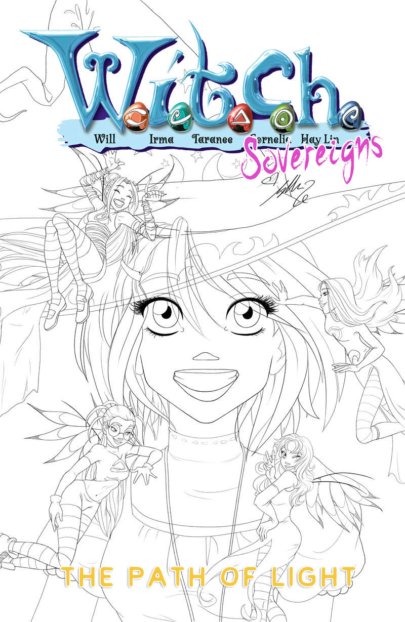 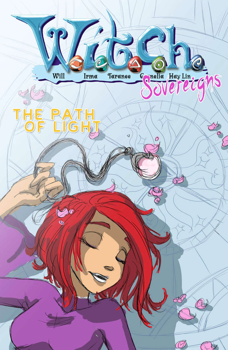 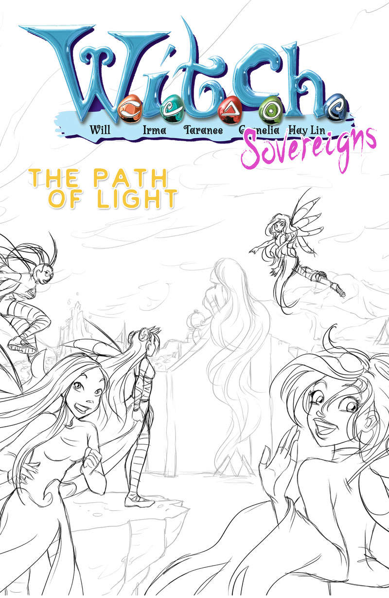 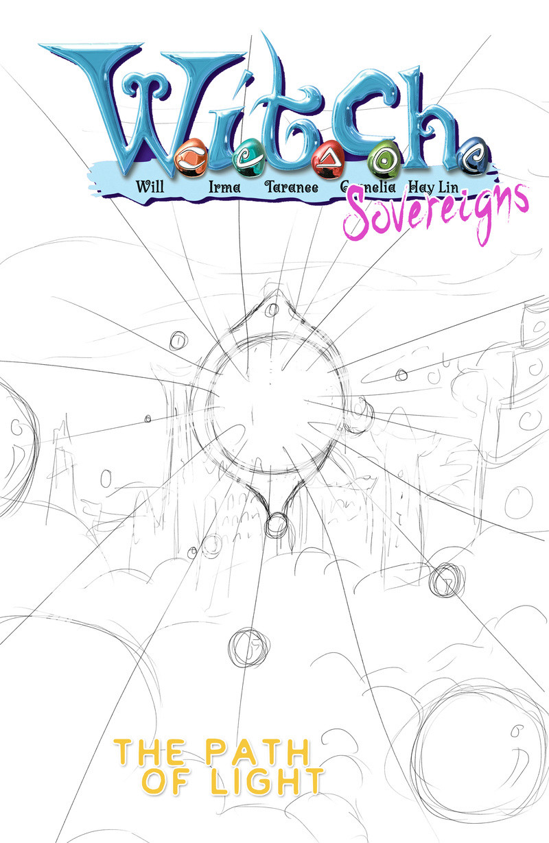 It's a little tricky deciding for one. They all have a cool atmosphere but it's hard to decide for the very first one. I don't want to show the new outfits right on the cover of the very first issue. So Number 3 is actually out since I'd have to redraw it with their new outfits. Number 2 is out because it's just Will and sleeping etc and it doesn't fit for the joy and stuff one should feel when having the first issue of the new series in hand. Number 1 is a redraw of the first comic cover so not sure if that's so great . Currently I like 3 and 4 the best. 4 is magical and mysterious and after all, the first issue will take place in Kandrakar, at least partially. So that might work. If you add in some special paper and silver shimmering effects for the rays that come out of the Heart, it could look very nice and intriguing. Oh and I wouldn't just show the Kandrakar fortress but as you can see, the tower of mist (right) and maybe the other tower of ice or something. It's more of a "Kingdom of Kandrakar" image than usually just the fortress. That way it seems newer even to those who're familiar with the series. Besides it's the first time the new Kandrakar - the Yan Lin Kandrakar will be shown on a poster or cover. Lots of talk. What do you think? Does that work? If it doesn't work for a cover for the first issue, what do you think about making it the cover for... the art book or maybe the lexicon thingy? |
|
|
|
Comics
Jan 18, 2018 15:28:23 GMT -6
Post by Cole on Jan 18, 2018 15:28:23 GMT -6
So sorry for the long wait of getting to this. I meant to get to it earlier, but I was put in a situation where I really couldn't do anything.
Each are very nice. Although 4 is my least favorite for a cover option. W.I.T.C.H just has to be involved in the first cover as far as I'm concerned. And all of W.I.T.C.H. Which puts out number 2 as well. Each are nice and can work for other things, but not for the cover of the comic. The one for Will could maybe work for the second issue or some later issue if Will is a bit more of a focus. The Kandrakar one I think would work perfectly for one of your studies. One of them is solely dedicated to Kandrakar, so putting this into them in some means I think would be good.
Number 1 isn't an exact copy of the first issue. Clearly it was the inspiration behind it and that's easy to note. But yours is a little different. Mostly in how Will is. But that altercation from the original I do believe would be enough to give the feel of being your own thing. It's nice and a wonderful callback to the series as a whole. It is a bit more on the simple side. Nothing super extravagant going on. More of a strong feeling of nostalgia. Which still works for me, but I just have the feeling that you are wanting something a bit more on the extravagant side.
Number 3 is my favorite. I think it works on a lot of levels and gives off that right feeling better then the others. One thing I think I'd like to see though is the lack of the villain on the front. And really I'd like for Irma, Taranee and Hay Lin to be a bit more like Will and Cornelia here. The two of them just seem like they are welcoming people back. "Welcome back! Come join us on our new adventure!" It's this whole feeling I get from the two of them. The others are more focused on the villain. But if the villain was removed and they were like Will and Cornelia then I'm not sure you'd be able to make a cover I'd like better then that.
|
|
|
|
Comics
Jan 19, 2018 2:32:34 GMT -6
Post by Yangi on Jan 19, 2018 2:32:34 GMT -6
Hm.... I see. I thought you might say that. I guess I'll keep the Kandrakar thing as an option for other purposes then or a later cover. Maybe the cover for the lexicon or whatever.
Ah, well the "villain" is actually just a giant statue of a woman on the really big wall of a city. You can't know that because it's just a sketch and there a different ways to interpret it but... that's what the idea was ehind it. The place they're at and that big city is where most of the magical adventure in Arc 1 will take place. And of cause there will be the magical villain, too.
Hmpf the trouble with number 3 is that I would have to use their new outfits already... technically. But I don't want to start with new outfits right on the cover. Hmpf. Oh well I'll come up with something.
|
|
|
|
Comics
Jan 19, 2018 2:45:48 GMT -6
Post by Cole on Jan 19, 2018 2:45:48 GMT -6
What exactly is the Lexicon again? Sorry I can't remember it well. I know we've talked about it before, but it's been a long well.
Ah, okay. The long hair made me think of Nerissa or Dark Mother. So I assumed maybe it was one of them. I know Nerissa is dead since this is based off of the comic. But I thought maybe she somehow came back. Although mostly I thought maybe it was Dark Mother. As I do recall us talking about villains who could have a chance to come back.
Is it a surprise thing you are doing it for? Let them start off normally and get a ways into it before new power and new outfit type of thing? I've sometimes questioned the point of having ITCH in their uniforms with Will on the first issue. I never thought too much about it, but sometimes I was a little curious as to why they did that.
|
|
|
|
Comics
Jan 19, 2018 3:34:36 GMT -6
Post by Yangi on Jan 19, 2018 3:34:36 GMT -6
The Lexicon is more or less my Studies just in one big book. The book doesn't exist yet of cause and since I'm only slowly gathering up all the info it might take a little while longer unitl I'll be finished with the whole thing but it's still something I would love to have in my shelf. A lexicon of WITCH! Where all the info is gathered about the characters and the world and eeeeverything!
Yeah, I thought so. No harm done, it really does look like a character. But it's just a really big statue of a woman with wavy hair.
Another idea I had was to make the same picture twice, once a magical version and once a normal one. There have been covers like that before so I figured it might be a concept I could use. So if we take number 3 for example, I could use this, just with their new outfits for the back of the comic issue and then maybe make a similar version with the 5 girls in normal attire welcoming the reader back to Heatherfield. So it's kind of a "Welcome back to Heatherfield!" and at the back it'S "Welcome back to magical adventure"! After all the real magical adventure will probably start in issue 2. Issue 1 is more of a "what happened up until now, where and when are we, what will this new series talk about, what are the new responsibilities and stuff for WITCH as Sovereigns, is there a new villain" etc. Lot's of intro and foreshadowing stuff.
Actually, I think I really like that idea. Using 3 just for Heatherfield and then for some magical world. That could be nice.
Well it's partially because I want the new outfits to be a surprise, yes. It's also partially because I think people might not like it if I start off with new outfits right away. It might come off as "I'm going to change all the stuff!" which I don't want. I want them to see that I do care about the former WITCH series and that I want to base it off of that. Of cause there will be a new set of uniforms and probably in the first issue, too but I want the reader to see them the first time when WITCH sees them the first time. You know? I think that's a nicer way to go about it. But maybe that's just my point of view.
For the first issue it worked really nicely for me. It was a good combination of normal girl along with magical fairy-like beings that pretty much summed up the entire comic series and that was awesome! Now for me it's a little different, since there already have been 139 issues of this series and while not everyone will have read all of them or any at all, I would like to find a way to... make people curiouse who don't know the series but also satisfy readers who've read every single issue along with the specials and maybe even multiple times. I guess I'm totally overthinking things...
But I think the "Welcome Back" concept is the best one to go for. I guess I could still add in some magic. Maybe make Kandrakar shimmer through the clouds far off in the distance or add some little bit of magic in the Heaterhfield picture. Yes, I think I'D like that. Hah, it's so much help talking about this stuff! Not sure if I would've come up with this idea if we hadn't talked about it!
What do you think about the idea? I'll do a sketch anyway and then we can check if that works. I can change the current Number 3 too so that the girls are wearing their new outfits so we have the actual set and can see them side by side.
|
|
|
|
Comics
Jan 19, 2018 3:43:39 GMT -6
Post by Cole on Jan 19, 2018 3:43:39 GMT -6
I actually did think that was what the Lexicon was about. But I wasn't completely sure.
Regardless I'm still very curious about the woman. Maybe the person could be a villain who had a statue made of herself to be placed at the front of the city so in a sense she is the first person anyone would see. Just a suggestion.
I don't really know if covers that have done that before. At-least none that immediately come to mind. But I really do like that idea!
I think maybe you are overthinking it, a little bit. I do get the point your are making. But at the same time I think you really need to find that balance of original; especially since it is directly based off of events that have happened. But also being sure to push a little more of your own things as it is your own story.
I said on an earlier post that little changes here and there and I don't think you'd be able to make a cover I like better then number 3 and I stand by that. I'm really feeling that we may have finally found the right cover for your comic. Now i'm really excited to see it! Hurry up! I want to see it!
|
|
|
|
Comics
Jan 19, 2018 4:19:52 GMT -6
Post by Yangi on Jan 19, 2018 4:19:52 GMT -6
True, I guess if I'm going to keep her in the city, she needs some kind of story. She won't be the actual villain but maybe she was one in earlier times and is like a warning to the people of the city or anyone who comes near it. Or it's some kind of goddess they worship or something. There actually were supposed to be several scattered along the great wall that surrounds the city. But the statues could be different people or they could the same woman in different poses. Actually that would be very interesting. Maybe if you go around the city or look at it from a high point within the city, you can see a story when looking at each statue one after the other. That would be cool.
I know of at least two who did that. But you're right. It's my comic so... if I want cover 4, then I'll just take that and if people don'T like it, who cares?! I should take care not to forget that fact... But I really like the new idea, too and I can't wait to start with it either!!! Damn, I have other stuff to do today... but maybe I can get to it tomorrow!
AAAAH! I wanna draw that so baaad!!!
|
|
|
|
Comics
Jan 19, 2018 4:28:40 GMT -6
Post by Cole on Jan 19, 2018 4:28:40 GMT -6
Well whatever you decide I'm rather intrigued by it. And I'd hope that even if it's a minor one, I'd like the statue to have some story to it.
It is a very hard balance to make though. Even on the point of deciding you'll just do whatever you want which is perfectly fine. But you do also want canon things or things connected to canon as well as your own things. It's a very hard mix to make.
AAAAH! I wanna see it!
|
|
|
|
Comics
Jan 24, 2018 9:31:25 GMT -6
Post by Yangi on Jan 24, 2018 9:31:25 GMT -6
Rigthy-oh! Here's the first draft of the two new sketches. It's a slightly cleaner version of number 3 and the WITCH girls are wearing their new outfits. I changed the background a tiny bit, though I moved it upward so the city is more in view. Before there was such a big whole with just sky that didn't look too nice. I might change Irma still, either not making her point towards something or making her point but then look towards the viewer. Not sure yet. I'm against having them all look towards the camera in this version though. I might do that in the Heatherfield one. We'll see. Once I have the Heatherfield version, I will add it here in this post, so we can see both covers directly beside or after one another. I think that's a good way to see if it would work as a front and back cover. 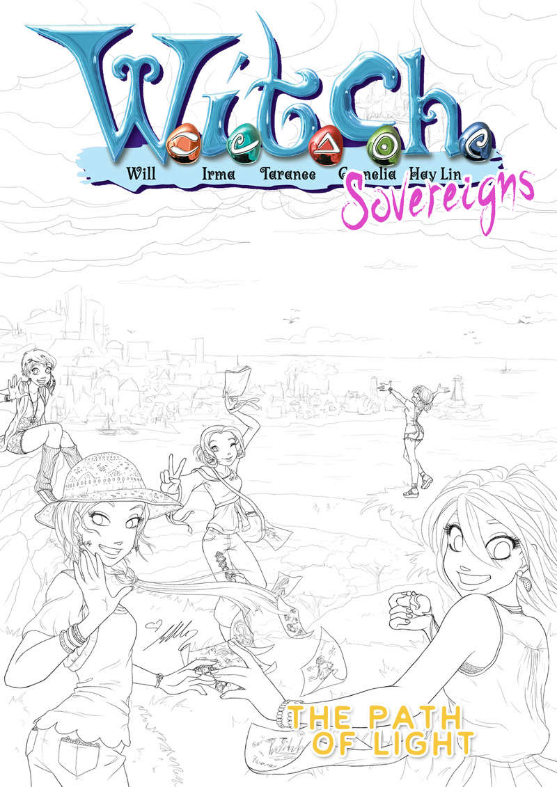 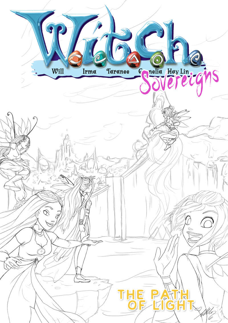 So voilá!!! Here they are both together! Left is the final idea for the front cover and I think by far the best one. The girls are standing on a cliff, looking down on the "heather fields", the bay and then their hometown in the back. In the clouds I was thinking about adding Kandrakar but because of the Witch logo, you won't see much of it so maybe I'll leave it out and make the sky less cloudy. From their attire wise it's very summery since the first issue takes place shortly after their summer vacation. Hm... I think Hay Lin should be more to the left. Right now she's directly in the centre and that's a little strange to my eyes. So I might change that a little, scoop her over to the left more. EDIT: Okay so I moved Hay Lin a bit more onto the left and also made Irma a bit smaller. This gives off a nicer concept I think and resembles more the positioning of the back cover. I'm going to post a small version of the first cover draft at the bottom so you can compare and know what I'm talking about all this time XD Finally, I want to make one last sketch of the Sovereign version, see how it works without the issue title and WITCH logo since it's the back of the comic and try out Irma's and Taranee's other hair style just so I gave them a shot. |
|
|
|
Comics
Jan 24, 2018 9:40:42 GMT -6
Post by Cole on Jan 24, 2018 9:40:42 GMT -6
Yes finally! Been waiting for what felt like forever for this next piece!
They each have an older look her compared to the other one. The first one looked a bit more like it's taking place immediately after the series ended or at the very least a short while later. Here they look a couple years older, more mature. Was that intentional, or is it just their outfits make them look a little older like that?
For this one I'm fine with them all not facing the front. Although I think I'd like the Heatherfield one to have them all facing the viewer. I think it's good if the cover really has this welcoming back type of feel to it. And I feel that them all facing the viewer helps with that. And then the back shows a bit more of the actiony and adventure aspect of things.
|
|
|
|
Comics
Jan 24, 2018 9:50:11 GMT -6
Post by Yangi on Jan 24, 2018 9:50:11 GMT -6
Wow! that was fast!!
True, though I didn't exactly intend to do that. Maybe it's just my style? Could be their outfits, too though. In any case the comic will start shortly after the old comic series, there won't be years between them so that's no reason for it. It just... happened. *shrug* But I don't mind it if they look a little older. I like that look and after all they're supposed to be nearing 16-17 and that means their magical self will look even older so... around 20? I guess then it makes sense. But... no haha I didn't really draw them older intentionally.
Yeah I agree. This one more of a "we're already busy exploring but hey, you can join if you want" while the front Heatherfield one should be more of a "Oh, hey, pal! Welcome back! Look at how awesome our city is and us, being happy and stuff!"
|
|
|
|
Comics
Jan 24, 2018 9:56:16 GMT -6
Post by Cole on Jan 24, 2018 9:56:16 GMT -6
I've been waiting for this for nearly a week! So I was ready to comment the moment I got an email saying you posted something here!
You think it works that way? I've never been sure. I guess in some aspects it could make a little sense to say at 16-17 they look 20ish. I wouldn't expect it to be the other way around and they look 16ish when they are 20. But really I guess with a whole new and unique costume it could be an easy way I think to explain it if you feel it's needed to be explained.
Yes! That is exactly what I'd love to see!
|
|
|
|
Comics
Jan 30, 2018 9:23:36 GMT -6
Post by Yangi on Jan 30, 2018 9:23:36 GMT -6
Just a quick preview of Corny for the Heatherfield cover with a few summer symbols because I felt it worked out nice for this small version: 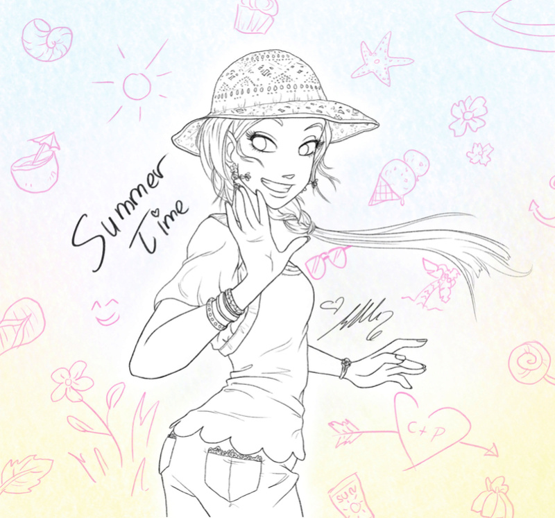 |
|
|
|
Comics
Jan 30, 2018 9:39:11 GMT -6
Post by Cole on Jan 30, 2018 9:39:11 GMT -6
Ah yes! Very nice!
|
|
|
|
Comics
Feb 3, 2018 11:33:35 GMT -6
Post by Yangi on Feb 3, 2018 11:33:35 GMT -6
Just uploaded the Version of Heatherfield right next to the Sovereign cover so we can see how they work together. The Sovereign one would of cause not have a title then and stuff since it's the back of the comic but just for comparing purposes... I also just switched them so the Heatherfield cover is first and the Sovereign (since it will be the back) is second. So this was the original version I posted here. Then I changed the positioning of Hay Lin and Irma a little and reposted it next to the Sovereign back cover above. It's the one I think I like better so I'm just going to show you a small version of the former cover here so you know what I was writing about (Hay Lin in the center and stuff) I think a small version is enough to see the change in position. I didn't change anything else. 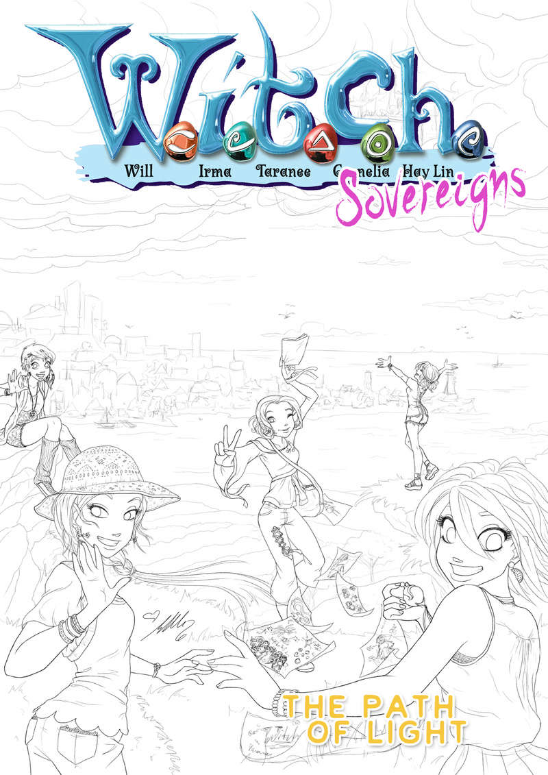 |
|
|
|
Comics
Feb 3, 2018 18:36:13 GMT -6
Post by Cole on Feb 3, 2018 18:36:13 GMT -6
Love it!
|
|
|
|
Comics
Mar 6, 2018 1:21:37 GMT -6
Post by Yangi on Mar 6, 2018 1:21:37 GMT -6
Here's the shaded version. I usually colour it first and then add some shading on top but in the "comic artbook" I got recently they did it this way around so I thought I'd give it a try. I have to say that up until now one good thing about it is that the Lineart looks a little cooler. I like this version a bit better than basic shading where just the colours are added. If I add the colour now it looks pretty fancy haha! But I have to see what it's like when I continue on. If it's any faster or better in the end or just another way to do it. 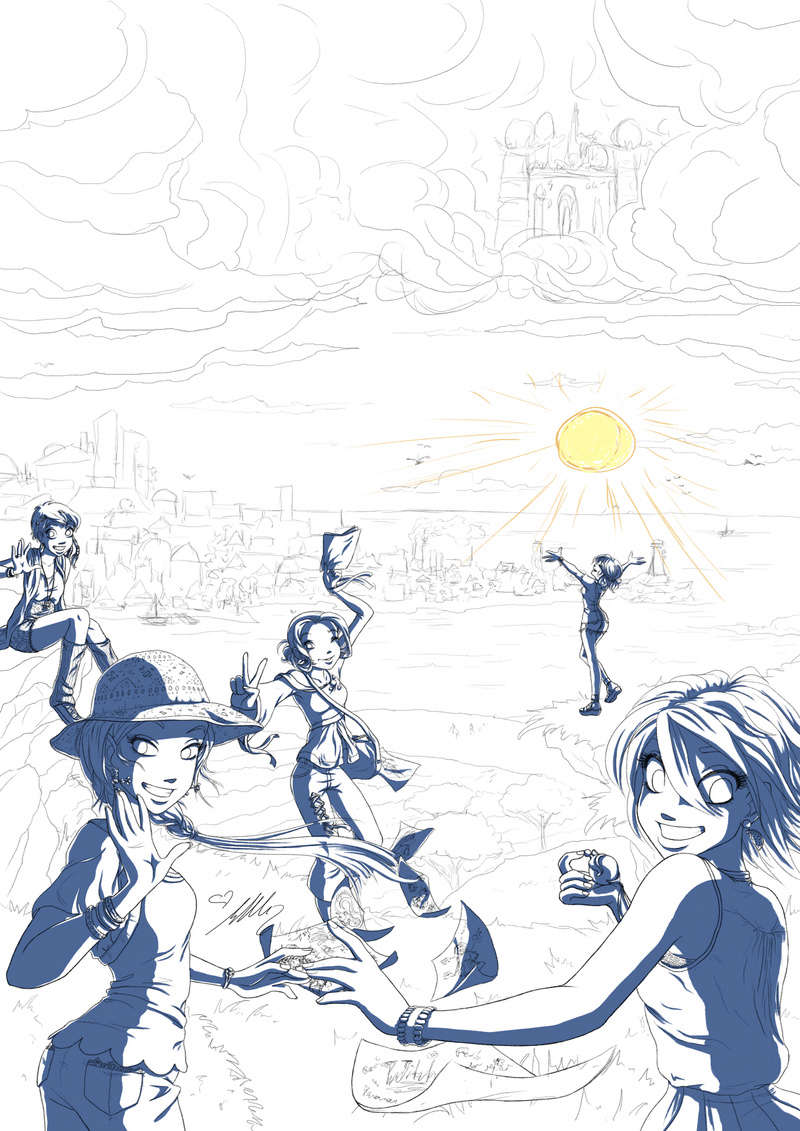 |
|
|
|
Comics
Mar 11, 2018 12:40:53 GMT -6
Post by Yangi on Mar 11, 2018 12:40:53 GMT -6
Voilà, the new official "Witch Sovereign" Logo!!!  The new official website is also under way! The new official website is also under way!
Wohooo!!!! |
|
|
|
Comics
Mar 11, 2018 12:43:29 GMT -6
Post by Cole on Mar 11, 2018 12:43:29 GMT -6
Wohooo!!!! Good news was badly needed! My heel has been killing me every since yesterday! I can barely walk and it hurts to do that. I needed the good news!
|
|
|
|
Comics
Mar 12, 2018 4:11:08 GMT -6
Post by Yangi on Mar 12, 2018 4:11:08 GMT -6
Oh no! That's terrible! Sorry to hear it. Yeah I feel like I made a big step just by finishing the logo. I did add my signature and also made a smaller version that can be used as an icon.  I should make myself a cool T-shirt with this... kind of like the "Team Witch-Sovereigns!" And everytime I work on the comic, I'll put it on! You know with this at the front and then on the back it says my role. Like "Comic Creator" or... "Comic artist" ... or "Lead contributor" or "Lead magician!" or... hm... it's needs an awesome title! |
|
|
|
Comics
Mar 22, 2018 13:44:03 GMT -6
Post by Yangi on Mar 22, 2018 13:44:03 GMT -6
Final Cover


|
|
|
|
Comics
Apr 16, 2018 10:11:20 GMT -6
Post by Yangi on Apr 16, 2018 10:11:20 GMT -6
Yey, the work is continuing! Just sketched out the next page and changed a few details about the text. Should I post the finished pages here, too by the way? Would you look at them here or comment on them here or not? Aaaaand do you want to see the sketch? It's super duper rough so not even sure if you can recognise that much haha...  |
|
|
|
Comics
Apr 16, 2018 12:56:51 GMT -6
Post by Cole on Apr 16, 2018 12:56:51 GMT -6
Hurrah! Yes of course! I've love to see the sketch!
As for rather you should post things here or not. I have no issue with that whatever. It's completely up to you. You have your own entire site for it, but posting it here gives you more chances for other people to come across. Not sure that'd be a huge number, but even if say just 1 or 2 people see it here and follow it; that's still good, right?
|
|
|
|
Comics
Apr 17, 2018 1:08:45 GMT -6
Post by Yangi on Apr 17, 2018 1:08:45 GMT -6
|
|
|
|
Comics
Sept 2, 2018 9:12:25 GMT -6
Post by Yangi on Sept 2, 2018 9:12:25 GMT -6
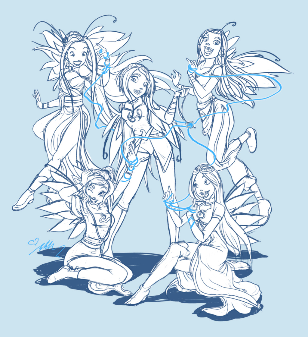
Ugh the links are turned off again... Oh well I'll have to fix that some time. Anyway until then, here's a sketch of WITCH in their Sovereign outfit. It's a possible team position after transforming. Or just some poster or whatever. Not sure yet. I just really wanted to draw them in their new outfits.
|
|
|
|
Comics
Sept 11, 2018 0:51:17 GMT -6
Post by Cole on Sept 11, 2018 0:51:17 GMT -6
I'm curious about the string.
|
|
|
|
Comics
Apr 22, 2019 11:06:52 GMT -6
Post by Yangi on Apr 22, 2019 11:06:52 GMT -6
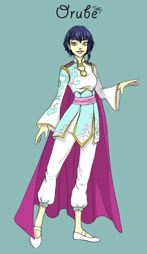
Orube Design Sketch Here's a first draft for a new design for Orube. I thought she'd wear something else now in the new comic and this was a design I had started to sketch roughly sometime last year.
The colour scheme and patterns are inspired by her first outfit from the Disney original and the design of the White Herolds, a troupe of soldier-like characters Kandrakar commands. They are seen in the original comic several times.
Her hair is a bit shorter too and the ribbon on the side is inspired by Basiliade hair styles. Many people there wear a ribbon to tie together a bun, pig tail or beard so I figured Orube would use this ribbon as a reminder where she comes from.
|
|
|
|
Comics
Apr 25, 2019 12:40:08 GMT -6
Post by Cole on Apr 25, 2019 12:40:08 GMT -6
Looks nice. I do like the idea of giving her a new attire for the comic. There is something to say for keeping with the known, that it gives this nostalgic type of feel, but I at the same time feel that it works to give her something new. This one does feel a bit more majestic then her normal outfit. Her normal outfit feels far more fitting to her style. That isn't saying this one can't fit, just doesn't currently feel like it fits that as well.
I don't believe I know the White Herolds, so part of this is lost on me.
|
|